Learning outcome P1
Photographing colors and color contrasts – they are important design tools in photography and can convey emotions very well. The image effect is strongly dependent on the selected colors or grayscale. Colors arise emotions, create moods and captivate the viewer’s gaze. In our world full of colors, it is a challenge to integrate them into an image in such a way that it looks appealing.
Photograph colors and color contrasts
While some photographers handle the colors intuitively, others first have to deal with the effects of colors and practice with them. Colors that are not very saturated appear very soft, sometimes almost a little melancholic. Therefor they are also called pastel shades. Whearas heavily saturated colors convey strength, happiness and are particularly colorful.
Colors differ in terms of tonal value, brightness and effect. The effect of color depends on many factors and is different for every person.
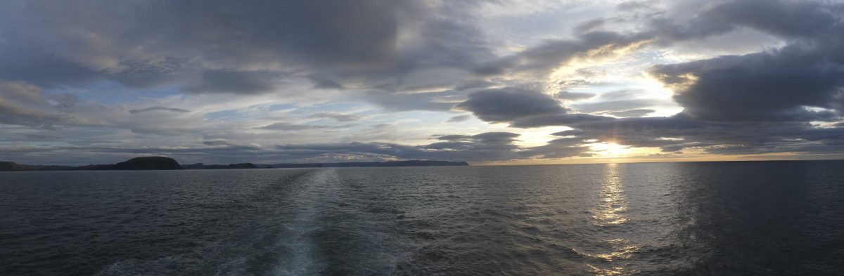
Red tones, orange and yellow are combined with sun, warmth, fire. They are also called warm colors.

Blue tones like the water, the ice, the snow look cold, even when the lake is in a warm area.

Yellow and red are signal colors – just think about the color of a wasp or the traffic red light. With signal colors you can set great color accents, but if they appear in the background, they distract you from the main motif.

When photographing colors and color contrasts, you have to be able to assess and interpret the mutual effects. A yellow next to a black works differently than next to light blue or red. Colors can reinforce or weaken each other.
RGB color model
(source: wikipedia)
The RGB color model is an additive color model in which red, green and blue light are added together in various ways to reproduce a broad array of colors. The name of the model comes from the initials of the three additive primary colors red, green, and blue. The main purpose of the RGB color model is for the sensing, representation, and display of images in electronic systems, such as televisions and computers, though it has also been used in conventional photography.
The RGB color model is additive in the sense that the three light beams are added together, and their light spectra add, wavelength for wavelength, to make the final color’s spectrum.

This is essentially opposite to the subtractive color model, particularly the CMY color model, that applies to paints, inks, dyes, and other substances whose color depends on reflecting the light under which we see them. Because of properties, these three colors create white, this is in stark contrast to physical colors, such as dyes which create black when mixed.

The RGB color model is based on the Young-Helmholtz theoriy of trichromatic color vision, developed by Thomas Young and Hermann von Helmholtz in the early to mid-nineteenth century, and on James Clerk Maxwell’s color triangle that elaborated that theory (circa 1860).
first use of RGB in photography
The first experiments with RGB in early color photography were made in 1861 by Maxwell himself, and involved the process of combining three color-filtered separate takes. To reproduce the color photograph, three matching projections over a screen in a dark room were necessary.

The additive RGB model and variants such as orange–green–violet were also used in the Autochrome Lumière color plates and other screen-plate technologies such as the Joly color screen and the Paget process in the early twentieth century. Color photography by taking three separate plates was used by other pioneers, such as the Russian Sergey Prokudin-Gorsky in the period 1909 through 1915.

The color wheel according to Johannes Itten
Johannes Itten was a Swiss painter and art theorist. While working with art students, Johannes Itten put together a color theory – the color wheel:

The primary colors red, blue and yellow are in the middle triangle of the color wheel. Mixing these creates the secondary colors violet, orange and green.
If these are mixed again, the colors appear in the outer color wheel.
Opposing colors on the color wheel are called complementary colors:
yellow is complementary to violet, orange to blue, red to green, etc.
Colors that lie side by side on the color wheel harmonize with each other.

If you want to combine three colors with one another, you can read the trio from the outer color circle with an acute-angled triangle.
Example on the right: red – orange – blue
Color contrast – complementary contrast
If you use two colors in your photo that lie opposite each other on the color wheel, one speaks of complementary colors or of complementary contrast. Red is complementary to green, yellow to violet and blue to orange.
Photography during the “blue hour” (the time between sunset and night or between night and sunrise) combined with the warm artificial light is very popular for this reason: The cold-looking blue shades harmonize perfectly with the warm, orange light of the artificial lighting.

daring choice of selected colors

good choice of composed colors


+ / – Compensation
The light meters are calibrated to a medium gray. If you photograph very bright colors like yellow, the light meter means that there is more light and causes a shorter exposure. The opposite happens with green: Green areas are washed out. On cloudy days, the colors look rather faint, while they really start to shine in sunlight.
Depending on the color, you will find that the light meter, which is calibrated to a medium gray, lies next to it. Green tends to overexpose, while yellow tends to underexpose. Correct the exposure for green by -1/3 to -2/3, for yellow +1/3 to +2/3.

P1
LikeLike